Showing posts with label picture. Show all posts

Tuesday, March 22, 2016

Party Colored Lion

I have several adult coloring books now, I have been experimenting with printing them out on cheap printer paper as well as higher end watercolor paper. This image came from a very inexpensive coloring book found in the Dollar General stores, you will have to go back to the children's coloring book & puzzle books to find this one, it's called Coloring Cats & Dogs and it's published by Bendon Books.

There are 3 titles in this series, and they all run $3.00 each, yes that's right, they are that inexpensive. Yet the paper quality is pretty good, and they are printed one sided, meaning you can color on a page without worrying about bleed through messing up what's on the backside. If you are using a medium that really bleeds through, like markers, it's recommended that you put another sheet of something behind the page you are coloring.

I colored this page with Marco Raffine colored pencils, they come in a 48 and a 72 pack, I have the largest pack, unfortunately they are not available open stock, but they are inexpensive enough, especially compared to the higher end colored pencils that it will not break the bank to buy another entire set. These pencils are an oil based pencil (as opposed to a wax based), they lay the color down pretty well and they layer beautifully. You can blend these as well.

My approach to this picture was to lay down a layer of the lightest color first, then gradually going into the areas where there would be shadows and shading, I applied increasingly darker colors in the same color family, for example, going from a light yellow, to a medium, then to a near brown. I wanted even more contrast so I picked up the black pencil and colored in the deepest shadows and shading.

Since this lion had so much small details drawn in (doodle style), I chose to color in blocks rather than trying to color in the tiny details, I also used very strong and unnatural colors, I wanted to play with these vibrant colors instead of trying to use natural colors for a lion. You may notice the one spot on the left side of the mane that is slightly browner than the rest of the mane, that was where I had started a few days earlier and didn't keep up with the colors I was using, it also shows that I'm not perfect... but I am very happy with how this turned out. If you wish to see how I do this, let me know and I'll be happy to make a video tutorial on how I do this.

Enjoy, click the images to see them full size.

#wrethareviews

Monday, March 21, 2016

Coloring Books - Experimenting

Adult coloring books are all the rage right now, I hope it's not just a fad and will be around for a good long time. I'm even considering tossing my name in the hat of creating coloring books.

But for now, I'm just playing with what's out there. Of course I can't leave well enough alone, I must push the boundaries of what can be done. Most coloring books are not meant to be archival, meaning the paper isn't the best, in order to keep the price low enough for people to want to buy, the publishers are using the only slightly better paper for the adult coloring books vs the children's books. If you are just coloring with inexpensive colored pencils or even crayons, that works out OK, but if you want to use wet media, markers or watercolor (pencils or paint), then the average adult coloring book paper leaves a lot to be desired.

As a result, many colorist will scan the pages and print them out on better paper, from cardstock to higher end art papers such as Bristol board and watercolor paper. If you have a laser printer, you are pretty much set to go from there, but many of us use ink jet printers, and unless you have a printer that will use a higher end ink that doesn't smear once dry, you will have a problem the moment you add anything wet to the page, the ink will most likely smear. Of course using dry media is fine on ink jet printouts, but if you are going to use watercolor or something else that is wet, you are heading for disappointment.

I just happen to belong to several Bible art journaling groups, and one thing most Bibles have in common is thin thin thin pages, and nearly anything you put on them, especially the wetter mediums, will nearly always bleed through, so the resourceful artists tried using clear gesso and even matte gel mediums on the paper and discovered it works great, it strengthens the paper, it protects the paper, it helps prevent bleed through. Guess what? This works GREAT for coloring book pages and the pages you print out.

I began to experiment with ink jet printouts on inexpensive (cheap) printer paper, I have coated the pages with clear gesso and also tried matte gel medium, so far I prefer the matte gel medium. I discovered that the clear gesso can cause the ink to smear a bit, but the matte gel medium does not affect the ink jet ink in any way, and one coat is sufficient. Be sure you use a MATTE finish product, anything that is glossy or shiny will not take the color you are trying to apply very well.

Here is a page I painted using Derwent Inktense blocks and pencils, I was liberal with the moisture and had no bleed through, the paper didn't fall apart, the page took the Inktense very well, in fact, it allowed me to treat it more like a watercolor in that I was able to lift some of the color in places to create highlights. Derwent Inktense applies and works like watercolor, but it is in fact an ink that dries permanently so you can do multiple washes without affecting the layer below.

I have not tried painting or coloring on a page with the clear gesso yet, that will be an upcoming project. I have read from other artists that using colored pencils is better over the clear gesso vs the matte gel medium because of the "tooth" that is created by the gesso. I will tell you that with the matte gel medium, the brand doesn't seem to matter, I use Liquitex matte gel medium, but in the clear gesso, it does matter, most of them are too rough to use markers over, they will ruin your markers, Liquitex clear gesso seems to be the worst, the better brands (smoother finish) are Art Basics clear gesso by Prima, Dina Wakley clear gesso by Ranger, and Tri-Art clear gesso.

This picture is from The Amazing World of Horses, just to recap, this was printed out on cheap printer paper with an ink jet printer, I coated one layer of Liquitex matte gel medium, let that dry then painted with Derwent Inktense blocks and pencils, let me know what you think :)


Friday, January 23, 2015

CRE8365 Day 22 - Snowy Photographs

Our weather has been so crazy, going from days and weeks of gray, ice fog to shirtsleeve near 70 degrees F, today (technically yesterday now) it snowed several inches of fluffy white snow.

I grabbed my camera and snapped a few pictures, these are my favorite 2 of the whole bunch, no Photoshop editing, it is what you see.

The first one is one of our wood piles, I thought the grain of the wood looked quite pretty, especially against the snow, one log looks like a heart.

The second one is the Sky Castle, it always looks like a fairytale in its blanket of snow.

http://cre8365.com

Wednesday, January 21, 2015

CRE8365 day 21 - Photographs

I decided to play with some photography today, I have 2 photos, the first is a chair done in the fairy furniture style, it's about 4 inches tall, I made this chair a few years ago, it now sits on a shelf over my bed.

The second image, I snapped a couple of days ago, we had been having days and weeks of gray, gloomy, icy days, the sun finally came out and it warmed up, I went outside to snap a few pictures, when I got back inside, I realized I had snapped some 270 pictures! Oh well, I was inspired everywhere I walked.

I particularly liked this one, the warm colored post in the background and the cool colored, gray, weathered stump in the foreground. I popped in into Photoshop and tweaked the image ever so slightly just to enhance the colors.


http://cre8365.com

Friday, July 12, 2013

Doodle #8


This may or may not be finished, not sure if I will add color or shading, for now I like it just as it is.  This is the second doodle I did at my friend's house the other day, I used a compass to make the circles within circles, then I filled the circles with patterns. Some would call this a mandala, but honestly I don't care for the spiritual implications of that word, I'm a Christian and not into Buddhism or Hinduism so I'll call it a doodle in the round :)

I especially like the outside ring with the squares and the squiggles. I'll definitely be doing more of these types of doodles. :)

This was done with a 005 and a 01 Micron pen.


Thursday, July 11, 2013

Doodle #6


Random doodling, this doodle happened while I was with a friend at the hospital, she was there for a routine procedure, this procedure takes the better part of 4 hours, she slept during much of it giving me the opportunity to work on a doodle.

I have been working on "seeing" patterns everywhere I go, believe it or not, there was so little to work with in that hospital room, not even the tiles on the floor had anything I could work with.

This one started out with a series of circles, then I began dividing up the spaces inside and between the circles. I like the idea of the lines from one element following and attaching to the lines of another element, gives it some flow, some continuity.

This doodle was done with Micron 005, 01 and 03, a grey marker along with graphite pencil for the shading, I'd like to get the shading more dramatic to give it more depth and dimension. The dark grey shape in the middle was done with a grey marker, but I decided I didn't care for how dark the marker ended up, it really covered up the design in that spot. I used a template to make the circles.

Sunday, May 19, 2013

Doodle #5

This was a strange one for me, it's the eye in the middle, I used to draw eyes all the time, all different sorts of eyes, human, animal and other... I need to work on incorporating eyes into my doodles better, this one is just right there in your face...
The birds and the sun are whimsical and take some of the edginess away from the eye. I don't know why or how I ended up with the squiggle going out of the square on the bottom, but I like the effect.

I like this one, colorwise, better than the previous colored one. I did this with a 005 and a 01 Micron Liner pen and colored it with Crayola colored pencils.

Doodle #4

I played around with color on this one, I drew a string then did the large pineapple looking thing, I added the hills, the houses and the circles on the bottom. I used a 01 Micron pen to do the doodles and Crayola colored pencils to do the color. I didn't color the circles at the bottom, I might go back in and do that sometime, for now though, they will remain B&W.
The houses are supposed to represent a song called "Little Boxes", it's about all of us living in little boxes made of ticky tacky, all doing the same thing... I chose to make all the houses red instead of all the colors mentioned in the song...

Thursday, April 25, 2013

Doodle #3

I know I said one doodle a day, I'm trying :) This was done using a black Micron liner pen in 01 and 005, and a regular pencil.


I have to say this is my favorite one so far. I created this one while sitting outside waiting for my laundry to dry, it was a perfect day, sunny, warm with a light, cool wind, my dog Zoe was nearby laying under a tree. Since I was outside, I didn't have any reference material nearby, I had to work from memory and making it up, ie being creative!

I began the doodle wanting to do more curvy or circular shapes, I started with the circles in the top section, I wanted to create the look of perspective so the circles started out large and shrunk as they moved farther away. I started to shade the circles then decided to leave them white, they look like they are rolling over hills coming toward you.

The left section is just a series of half circles, sort of like sea shells. The far right is vines with leaves on a starry background.

A few days ago I saw a picture of dogwood blossoms, I really liked the graphic shape and lines of the petals, they were perfect to include in this doodle. The bottom section is where I deviated from the round shapes, although if you look closely you will see an undulating pattern to the horizontal lines, when I look at it just right, it looks like draping fabric.

I added some pencil shading to create depth and it was finished. I have to work on working slowly, not getting in a hurry to get the pattern and image finished, it's good to enjoy the zen like qualities of drawing without worrying about getting finished on a time schedule.

Oh and FYI, I now have a light over my computer area, it's about a foot and a half from the surface of the table so it's perfect  for drawing and doodling, thanks to PB!

Crayon Horse

I enjoy working in color as well as pen and ink. Many years ago I experimented with Crayola crayons, I did some ocean and lighthouse scenes, they turned out pretty well, if I can find them I'll post them here.

I wanted to get back into using crayons, I have discovered coloring books for adults, more details and subject matters that appeal to the more mature as opposed to what is promoted to kids. I downloaded this image of a horse and worked it with crayons. My technique is to lay down light (pressure) layers of color, after each layer I use an eraser to smooth out the color and remove some of the waxy buildup so that I can lay down more color on top. One thing that is difficult to do with crayons is get dark black, it ends up looking a pale gray, so I used a black Sharpie marker to put in some of the darks. Oh and I almost forgot, I wanted to add a highlight to the eye, and a tiny highlight in the nostril, I used some white nail polish, it worked like a charm!

I did not draw this image, I only colored it, enjoy!

This image came from this coloring book:

Tuesday, April 23, 2013

Doodle # 2

Here is the one I started and completed today, I have been having such a good time with these, I am working on getting them neater looking, again I blame the lighting, uggghhhh, I have GOT to get some sort of light near my computer area, even in the day it's not well lit up here... ok, enough excuses, here is my next tangle.


I'm happier with this one, it actually looks pretty good for my second attempt, it looks a lot more detailed and neat. I used my newest line markers on this one, I also added some shading with a pencil in the middle area (that design is called a "mooka").  The design in the upper left corner looks like a school of fish to me :)

I used a pencil to sketch out the string, and used my pencil to draw in some temporary lines in the upper left corner design to get the squares and inner squares more precise, the pencil lines were then erased after I drew in the designs.

A few days ago I spoke to our town librarian about this, she hadn't heard of Zentangles or anything like this, I did a quickie one on the spot to show her what they look like and how it works, she really liked it and could see the potential, we discussed possibly having a class at the library for the after school kids and even the adults, I am excited about doing it, will have to work on the structure of the class, how long it should last and what materials I will supply and what the kids will need to bring. I think this could be easily done with some printer paper, a pencil, and a thin Sharpie marker, we could also add some color with colored pencils, crayons and such.

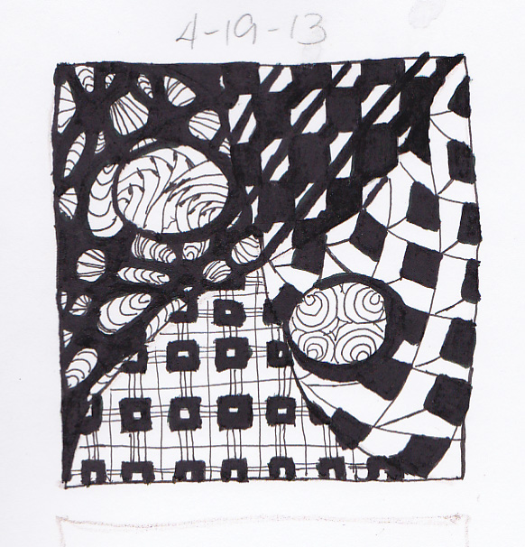
Doodle #1, The First One Is The Hardest...

Well, after some fussing over the name of this blog, this became West Texas Doodle Blog (as opposed to West Texas Doodle Bug)... thanks to my friends over at FaceBook for helping me to decide...

So if you are here reading this, first I want to welcome you here, and warn you, the look of this blog is liable to change, morph, grow, so if you come back and find a new look, rest assured you are at the right place.

A little about myself, I'm knocking on 50, not there yet, but closer to 50 than I am to 40... I am a wife, mom, grandmother... I had an "interesting" life, in some cultures that is considered a curse, to me it is just who I am. I am an artist who loves music, or a musician who loves art? I think it's all entwined, the DNA in my body is full of art and music. I thank God for giving me these gifts, without Him all of this would be worthless, with Him all of this is priceless.

I recently got back into drawing a few months ago after taking a 20 something year hiatus. I began feeling that "itch" that all artist understand, I've ignored that itch quite well over the years, not because I wanted to, but because I didn't feel like I had the time or space to devote to it.

Now I have lots more time, even though I think I'm busier than ever, I'm living a different life, and there is room for art now! Where I live, I am surrounded by some very talented artists, that coupled with the great views where I live, I can't help but be inspired to take up this soothing yet invigorating craft.

I enjoy working in color, I have worked in oils (didn't care for that), acrylic and watercolor, I have started playing around with Crayola crayons and have had some successes with that medium. I am also playing around with something referred to as Zentangle or Zendoodle. It's an advanced method of doodling, somewhat structured yet still doodling, I like it in B&W as well as color.

I'll be posting my work as I get more of it done, I'll also post some WIPs (work in progress) as there are always WIPs going on... I'll also post some of my past works, I always enjoy seeing the progress of other artists, so I'll give you the same opportunity to see what I have done...

I have some decent pen liners to do some Zentangles now, it's amazing what good tools can do, I think I'll create the goal of doing one Zentangle or doodle a day and posting it, no guarantees though, I'll do my best and here is the first one.

Yup, this is it, it's messy, it's imperfect, but it was fun! I'll have another one to post soon. Oh and in defense of the messiness of this one, I did it in semi-darkness, I don't have a good light near my computer area, during the day I have lots of light but if I work at night, which is when I often work, well lets just say it's not as easy to do more precise work in low lighting situations. I am also trying to decide if I want to do more freehand works (like this one) or try to use tools to make more precise lines, such as rulers, templates and such. I'm still learning and having fun, I also want to develop my own style.